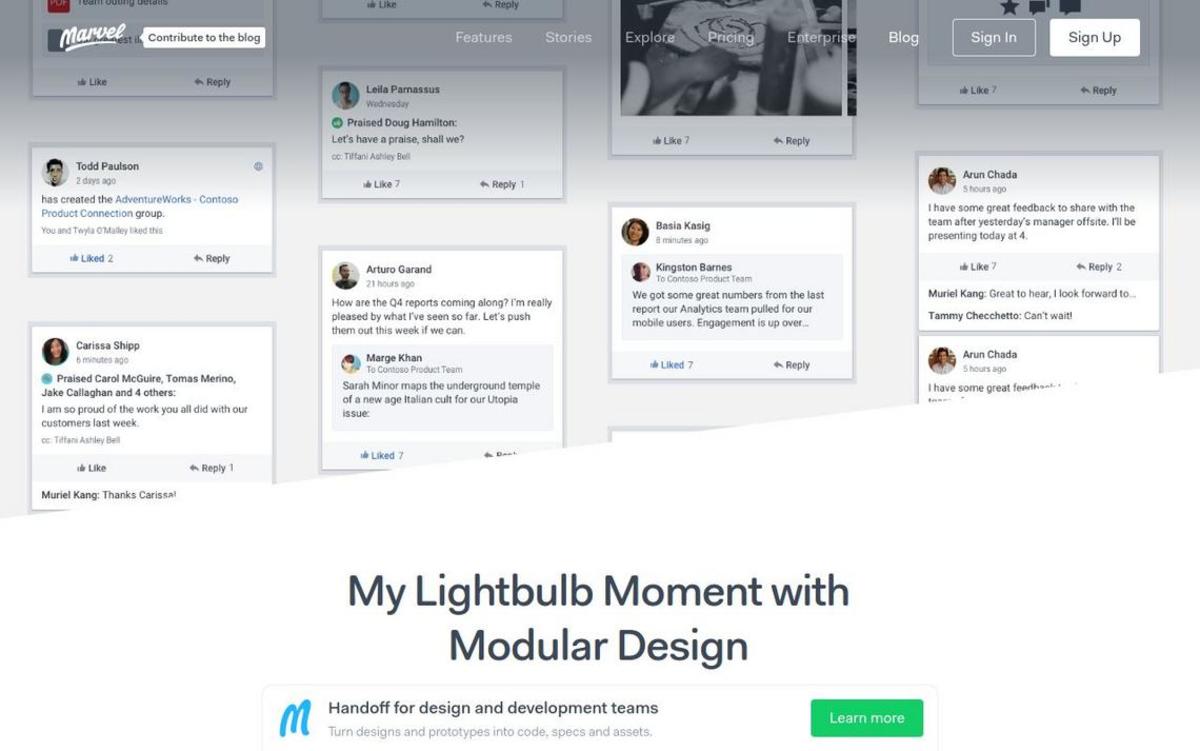
We grouped each chunk of a Yammer thread the same way our developers were grouping them in the code. To help out our eyes, we assigned each one its own color. At this point we also started referring to the chunks as modules, because we fancy.
We stopped defining margins between modules. Instead, all the spacing in the app would come from padding within the modules — specifically, top padding. Bottom padding would have worked, too; just not both. The key is to choose one of the two and stick with it. This kept things simpler when we did need to define top and bottom margins in some special cases.
We threw all of the individual modules into one super long artboard. It looks pretty weird, because this is not a conversation that would ever actually exist in Yammer. It’s okay, though. All we need it for is checking alignment on our grid and making sure every type of element is accounted for.
When everything was laid out vertically, we still had three specific combinations that were throwing things off. This was okay with us — three was much easier to deal with than hundreds. Our engineers went to work defining special “if…” statements for each of them.