Leading-Trim: The Future of Digital Typesetting
How an emerging CSS standard can fix old problems and raise the bar for web apps

The problem with text boxes today
In a standard text box, there’s almost always extra space above and below the actual text. Because of this, when you use a text box to measure and implement spacing, it ends up larger than you intended. The bigger the line height, the bigger the problem. The example below shows distances between text boxes set to 32px. As you can see, all the vertical spacing is visually much bigger than 32px, even though you set them all to the same value.

This is a common problem that spans tools and platforms. In my last Medium article, I talked about how I use the 4px baseline grid to measure spacing around text and achieve better visual accuracy. Knowing the imperfections of this approach, I kept searching for a better solution. Last June, I came across an emerging CSS feature spec called leading-trim. I’ve been working with the author of the spec, an expert from the W3C CSS Working Group, fantasai, to make sure Microsoft Design can be a part of this transformative work.
Today, we’re excited to announce that Microsoft Design is sponsoring the authoring of this new spec. This article gives an introduction to this new CSS standard, leading-trim, and what it could mean for web designers and developers.
How we got here: a history lesson
To understand how this became a problem, specifically on the web, we need to go back in the history of typography. Around 140 years ago, type was still set manually with individual lead boxes. To make text more readable, typesetters would put strips of lead to space lines out. (That’s where the word “leading” came from 😉) The height of the type block plus the leading add up to the total line height.

Early graphic design software in the ’80s kept the same tradition where people could add bottom leading directly to control spacing between lines, and line height would increase as a result. Other software made it a two-way street, where people could adjust the line height directly. But behind the scenes, bottom leading was always the part that was changing.
Things diverged after the invention of the web, with CSS1 debuting in 1996. The people who created CSS1 decided to split leading in half and put it above and below each line. They called it “half-leading.” Their reason was simple: make text boxes looks even.

While half-leading creatively avoided uneven bounding boxes, it introduced its own problems. Each font size in a font family comes with a default line height. Default line height is usually designed to be taller than the text it contains to accommodate certain characters and accent signs. Increasing line height then adds two half-leadings, making the text box even bigger. Half-leading, together with the extra space reserved in the default line height, is the root of our text box frustrations today.

Workarounds are just workarounds
Some of our most popular UI design tools, such as Figma and Sketch, seem to have adopted the half-leading model and render text this way. So we experience this problem in both our design tools and browsers.
The workaround on the design side is relatively easy: you can ignore the bounding box and directly measure space against text’s cap height and baseline. It’s a manual process because most design tools don’t have snap targets for cap height and baseline, but I know we designers will do anything to make our design look good!
But if we take this approach, developers still implement only the bounding box spacing in CSS. Therefore, they would get seemingly random spacing values.
To mitigate this randomness issue, developers can “crop” the text box in CSS with negative margins. But the negative margins would need to be determined manually and are font specific, and therefore “random.” Any font, browser, operating system or locale change will inevitably throw off your carefully set margins. Besides, this technique is generally not a good coding practice and can cause unintended side effects.
Introducing leading-trim
Leading-trim seeks to change the standard we’ve been using for 24 years.
Leading-trim is a new CSS property that the CSS Working Group is introducing. Just as the name suggests, it works like a text box scissor. You can trim off all the extra space from reference points of your choice with just two lines of CSS.

h1 {
 text-edge: cap alphabetic;
 leading-trim: both;
}
The example above first uses text-edge (also a new property) to tell the browser the desired edge of the text is the cap height and the alphabetic baseline. Then it uses leading-trim to trim it from both sides. Note that leading-trim only affects the text box; it doesn’t cut off the text within it.
These two simple lines of CSS create a clean text box that hugs your text. This helps you achieve much more accurate spacings and create a better visual hierarchy.

Leading-trim fixes alignment issues
With leading-trim, you can finally fix all the mysterious alignment issues you see on your site. For example, maybe your text doesn’t always look vertically centered in a container even though the text box is.
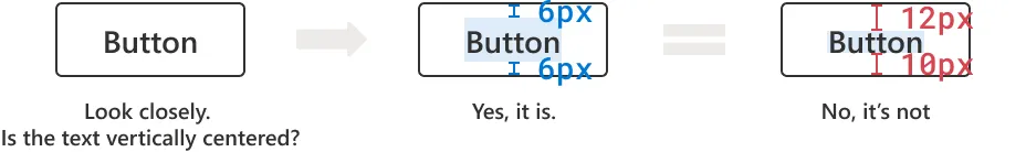
The extra space reserved in the default line height causes text to not always be centered in the text box. With leading-trim, you can reliably vertically center your text.

Each font is also designed differently. It comes with its own default line height and the text within it could have a different size and baseline position. So sometimes even if font size, line height, and text box position stay the same, changing the font changes the alignment of the text, just like the example below.

In the second example, you can see how leading-trim prevents this and keeps the text true to form.

Other immediate impacts: consistency and workflow improvements
Leading-trim goes beyond making spacings and alignment more accurate. It plays a key role in enabling an accurate spacing system, paving the way for design accuracy and consistency and efficient design-to-dev handoff.
A spacing system is like t-shirt sizes for spacing values. Like how a color palette or type ramp is set up in code today, spacing values can also be represented using CSS classes. (To learn more about spacing systems, check out Nathan Curtis’s Space in Design System.)
There are a lot of benefits to having a spacing system. Designers can make spacing decisions faster, and developers can set up corresponding spacing variables to eliminate random, hard-coded values in code. But today, even if we set up a spacing system, it wouldn’t be accurate for text elements because of the extra space in the text box. If we try to ignore the bounding box in our design and “crop” the text box in code, we run into those tricky workaround issues.

With leading-trim, designers can finally unlock the power of a spacing system. Starting from design, we can apply a spacing system on top of measuring optical spacing (measure against type’s cap height and baseline). In addition to accurate spacings, it will help us establish better visual hierarchies and have more confidence in our layout.Overall, we can improve design consistency across the board.
The design-to-dev handoff process will also be much smoother because developers will be able to set up the exact same system and avoid spending tons of time on layout bugs. Most importantly, the spacing systems leading-trim enables will help us deliver more visually polished products that our users trust and enjoy.
Small change, big implications
Beyond craftsmanship and making handoff more efficient, we hope leading-trim will turn a new page for digital typesetting, eventually motivating improvements to other standards and platforms, starting with OpenType.
Leading-trim works by browsers accessing the font metrics to find, for example, the cap height and baseline. As the standard font format, OpenType specifies what metrics to include in the font file. OpenType has been jointly developed by Microsoft and Adobe as an extension of Apple’s TrueType font format since 1997. While today OpenType has robust support for Latin scripts and CJK languages, it still lacks key metrics for other less commonly used writing systems such as Hebrew or Thai. As people adopt leading-trim, we hope this leads the way for us to add more font metrics of other writing systems to OpenType.
Ultimately, we hope leading-trim helps improve OpenType and its internationalization by ensuring equal typographical capabilities across the world. That’s just the start of the ecosystem. Once leading-trim becomes available in all the modern browsers, desktop applications that are built using web technologies, such as Figma, Teams, and VS Code, will also be able to utilize it.
The impact can also go beyond the web. Sketch has already added snap targets for cap height and baseline. Instead of holding down the Option key to show bounding box to bounding box spacing, you can hold down Control + Option to see baseline to cap height spacing. It makes measuring optical spacing a lot easier. More importantly, this shows the slow shift in the way people approach digital typesetting. We are hoping leading-trim can further encourage this change. And through this mindset change, beyond just snap targets, leading-trim might just become a new text rendering standard in our design tools and extend to our operating systems.
Microsoft’s role in this effort
Leading-trim is a part of the CSS Inline Layout Module Level 3 specification that fantasai is working on. There are four other proposals included in the spec with a common goal of fixing CSS text layout.
Microsoft Design is sponsoring the authoring of this spec as the first step of CSS standardization. The spec will provide the blueprint for each browser to implement so web developers and designers around the world can use the features it introduces. But we hope our involvement goes beyond that, from extending the OpenType specification to browser implementation, product integration and testing, and more.
We believe that this new specification will help move the needle in accessibility, internationalization, and craftsmanship, and we are extremely proud to be part of this initiative.
We look forward to the partnership with the CSS Working Group and fantasai, the cross-team collaboration that will happen across Microsoft, and are excited about what the future holds.
Special thanks
I’d like to extend a special thanks🎉 to my content designer, Perry Holzknecht and my manager Annie Bai for their help and support along this journey. I would also like to thank Jonah Sterling (our General Manager for Cloud+AI Studio), his design leadership team, and Ana Arriola (General Manager & Partner for AI Product Design & UX Research, NeXT.lab) for their help and guidance throughout this process. Thank you so much🎉 for making this happen!
And last, but not least, a huge thank you🎉 to Brook Durant (Senior Design Manager at Web Experience Collective (WXC) Studio) and Albert Shum (CVP of Design for WXC Studio) for sponsoring this effort!
Questions or comments?
Please don’t hesitate to let me know if you have any questions or comments. Additionally, fantasai is also welcoming feedback on the CSS Inline Layout Module Level 3 spec in the CSSWG’s GitHub repository.
Reference
Marcin Wichary’s Figma blog post Getting to the bottom of line height in Figma gave me the knowledge and inspiration that led me on this journey. I highly recommend reading it!
To stay in the know with Microsoft Design, follow us on Twitter, Instagram, Facebook or join our Windows Insider program. And if you are interested in joining our team at Microsoft, head over to aka.ms/DesignCareers.
