Optical adjustments in components
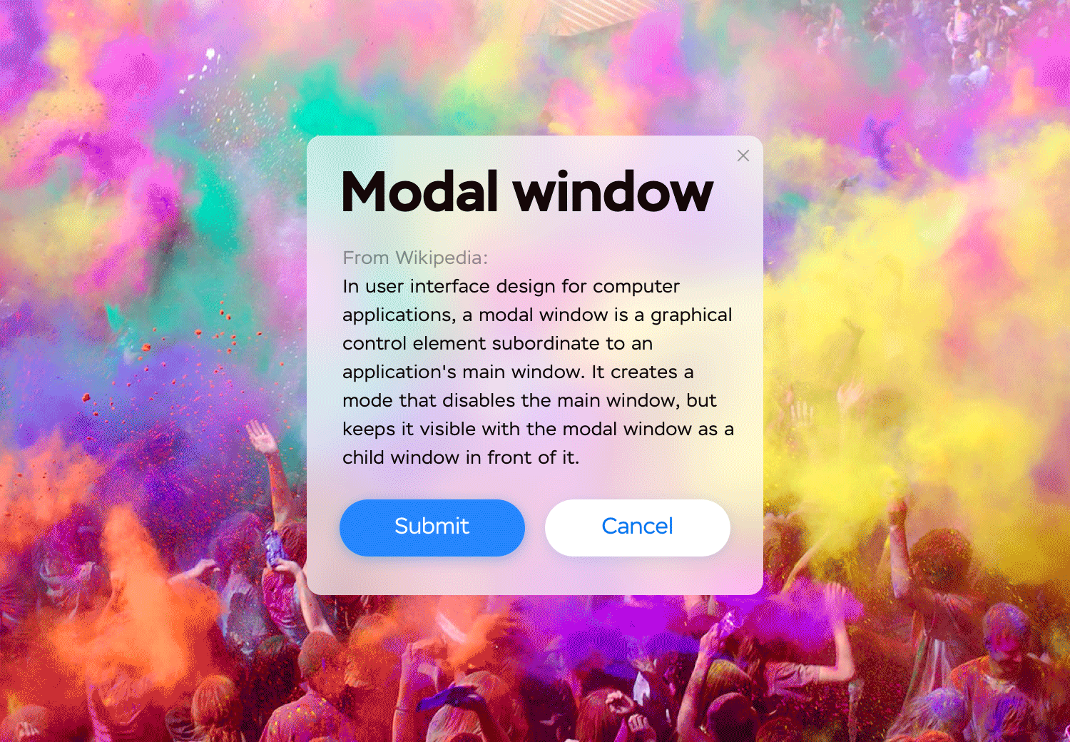
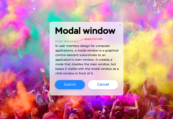
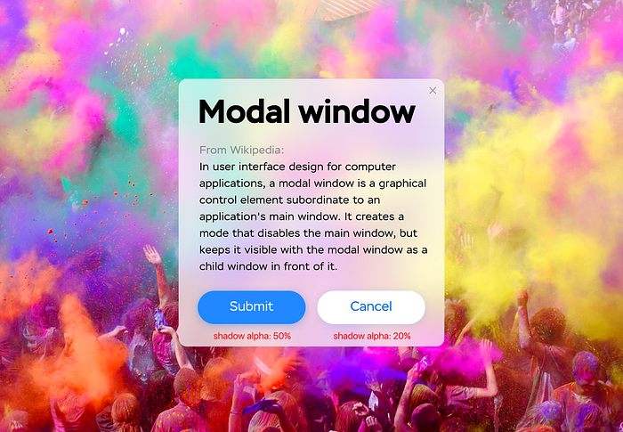
Every time you look at a computer interface, your brain is trying to fool you. No matter how hard you try to make things look aligned — the eye of the beholder will often disagree, due to a way we are wired to perceive objects in real life. So, as designers, the only option we have is to fool viewer’s brain back. In this article, I will show you few things to compensate for when designing components. Take a look at this simple modal window for example.


It’s hard to tell the difference right away, so here’s a GIF to help:
Adjusting for gravity
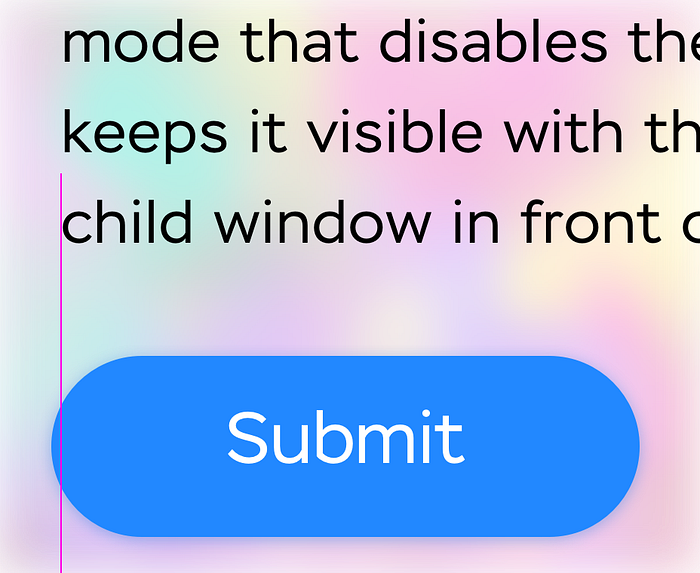
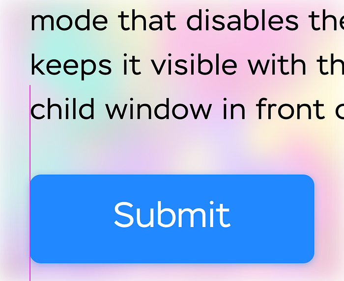
Any physical object in a real world is affected by gravity. Meaning, it tries to fall down once lifted. Our brain applies the same real-world expectations to the elements of the interface and assumes that any object on screen is “trying” to fall down. Even when the object is entirely static, our brain still expects that it will start moving downwards (space above the object will increase, and space below will decrease) and adjusts for it. An object, perfectly centered vertically, will appear lower than it actually is. In order to align an object optically, we have to counter-compensate for gravity “expectations” and lift an object up a bit:

The bigger is the object, the “heavier” it is and thus “drops” faster (let’s not remind ourselves about vacuum this time :) — so we need to compensate more for bigger objects, and less — for smaller ones. A container that holds “lighter” buttons is shown in pink:

Adjusting margins for rounded buttons
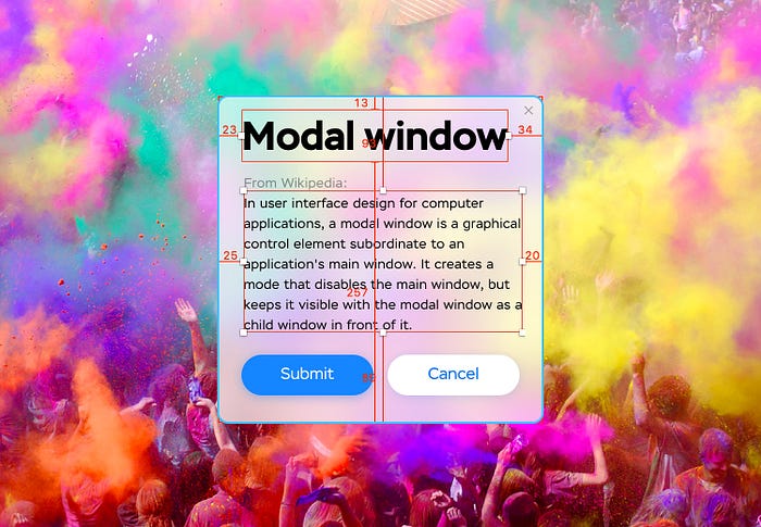
It is also a good idea to slightly shift your rounded buttons beyond the guides.
Otherwise, a button will be perceived as slightly unaligned, “shifted in”. At the same time, if your button’s corners are rounded to a lesser extent and you can still draw a straight line adjacent to the edge — you don’t need to compensate:
Adjusting margins for headings
Same principle applies to headings, especially to larger ones. With bigger font sizes, paddings around each letter become more apparent and it breaks the perception of the left border. To account for that, I apply a small negative left margin:
Surely, it’s tedious to apply this to every single heading in your design, as this is a manual process, but for more prominent ones (e.g., on a landing page) it is worth the effort.
Adjusting a right border of a text block
With left-aligned text, right edge of a text block becomes “ragged” and the right border is optically shifted. As in a case of a rounded button, I will shift the whole text block slightly to the right in order for it to appear centered:

This way, right border sits closer to an implied vertical guide on the right. You can see the obvious difference in perception if we don’t apply this rule:

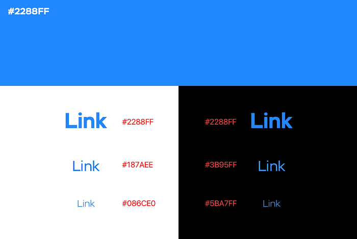
Adjusting for color
A color is perceived differently depending on the area it fills. A certain color applied to the text on a white background will appear paler than the same exact color applied uniformly to a large block. On the contrary, if we put colored text on a dark background, its color will appear darker. Backgrounds “absorb” thin typefaces and text color is always visually shifted towards the color of a background. To adjust for that fact, I make a color a bit darker when used on the light backgrounds, and lighter — on dark ones.

The smaller font size and weight, the more you need to compensate:
Adjusting for greyscale
This is a particular case of color adjustment. I try to pick a shade of grey by taking a 100% black and modifying its opacity, not by setting color values directly:
That way, your grey would not be “washed out” when you darken a background:
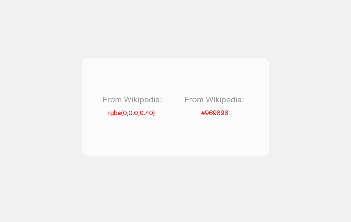
Semi-transparent black helps achieve a readable result without creating a lot of different styles. For darker backgrounds semi-transparent white is also an option:
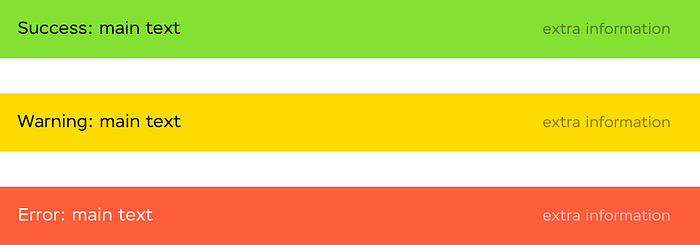
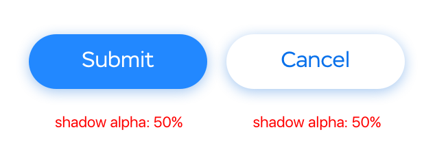
Adjusting a shadow density
I use different shadow density depending on the color of the object that produces a shadow. For darker objects a shadow should be made more intense, for lighter ones — more transparent:
Without that trick, a shadow from a lighter object will appear darker next to the shadow from a darker object, given that both shadows have the same opacity:
Surely, not every project deserves extra time spent on optical adjustments, but if the interface you are developing calls for a special attention and needs to stand out — using all the tricks above will lead to a more harmonious result.
