|
|
|
#UX #UI #Accessibility #Branding
Many apps use their brand color on their call-to-action buttons. Doing this may seem like a harmless act of branding, but it can actually hurt the user experience. Brand-colored buttons can lead to…
|
|
|
|
#accessibility #free #tools
WAVE® is a suite of evaluation tools that helps authors make their web content more accessible to individuals with disabilities. WAVE can identify many accessibility and Web Content Accessibility Guideline (WCAG) errors, but also facilitates human evaluation of web content. Our philosophy is to focus on issues that we know impact end users, facilitate human evaluation, and to educate about web accessibility.
|
|
|
|
#Accessibility #Books #Audiobook #A11y
To celebrate and contribute to Global Accessibility Awareness Day, we at the UX Collective have partnered with our most prolific accessibility writer, Sheri Byrne-Haber, CPACC, to bring a more candid take on the topic.
|
|
|
|
#Accessibility #UX #UIdesign #BestPractices
Did you know that perfectly healthy people with great sight, hearing and mobility, who can read and write effortlessly, can multitask effectively and who are fully functional all of the time make up…
|
|
|
|
#Accessibility #UIDesign
Neumorphism is predicted to be one of the top 2020 UI design trends. You might have seen it everywhere as a Dribbble shot. Neumorphism is a play on words based on New + Skeuomorphism. It is a style…
|
|
|
|
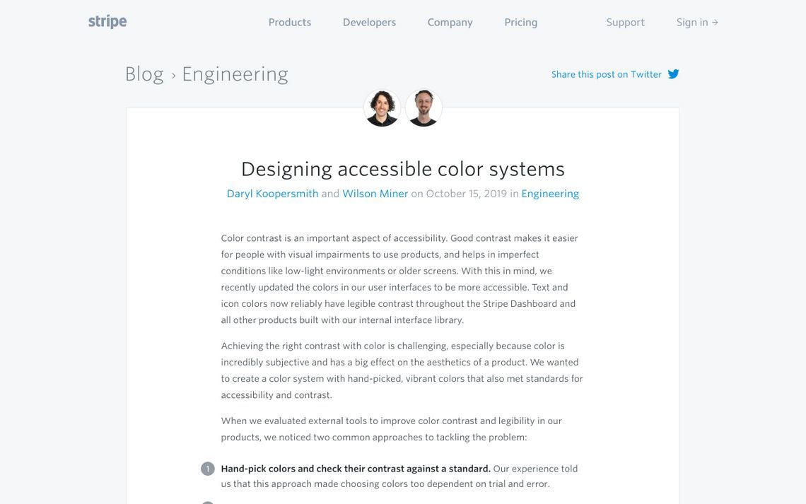
#Accessibility #Color #UX #UIDesign
How we designed a color system with hand-picked, vibrant colors that also met standards for accessibility and contrast.
|
|
|
|
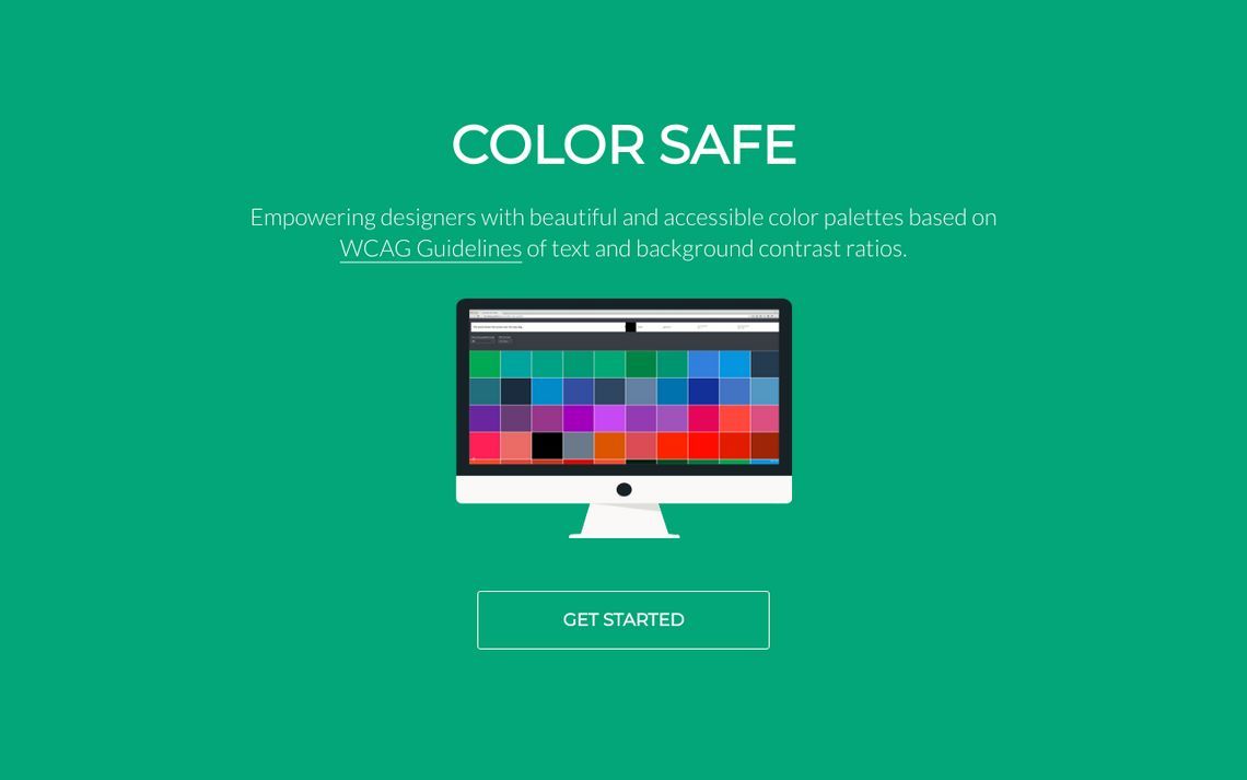
#Accessibility #Productivity #Tools #WCAG
Color Safe is a tool to explore beautiful, accessible color palettes for your website based on Web Content Accessibility Guidelines (WCAG).
|
|
|
|
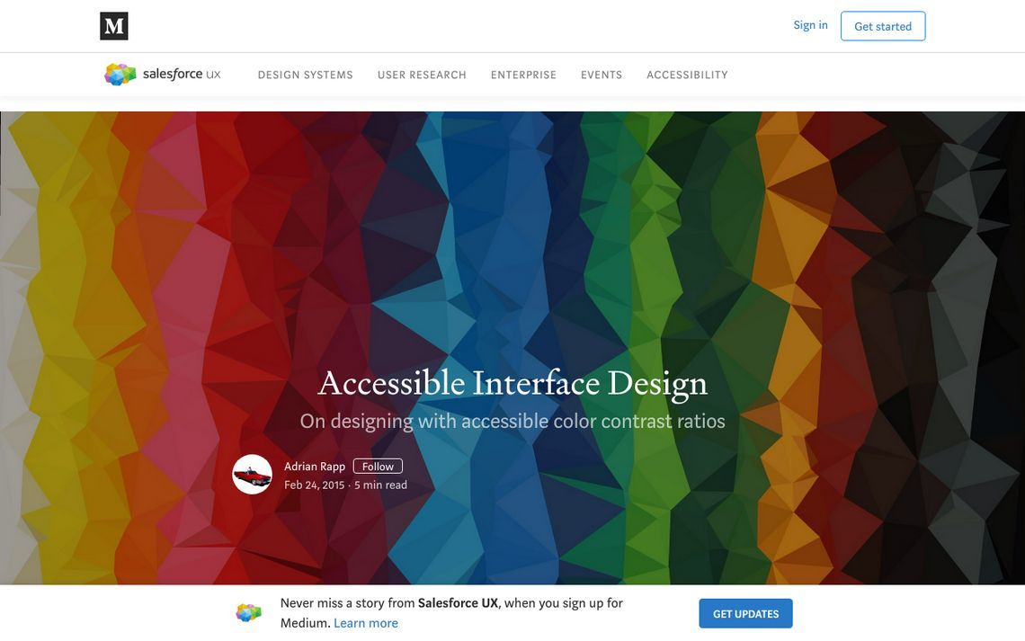
#UIDesign #Tools #Accessibility
A year ago I joined the Salesforce UX team as a Product Designer working on Mobile Self Service products. I came from a small startup, so I was new to practically everything happening at such a large…
|
|
|
|
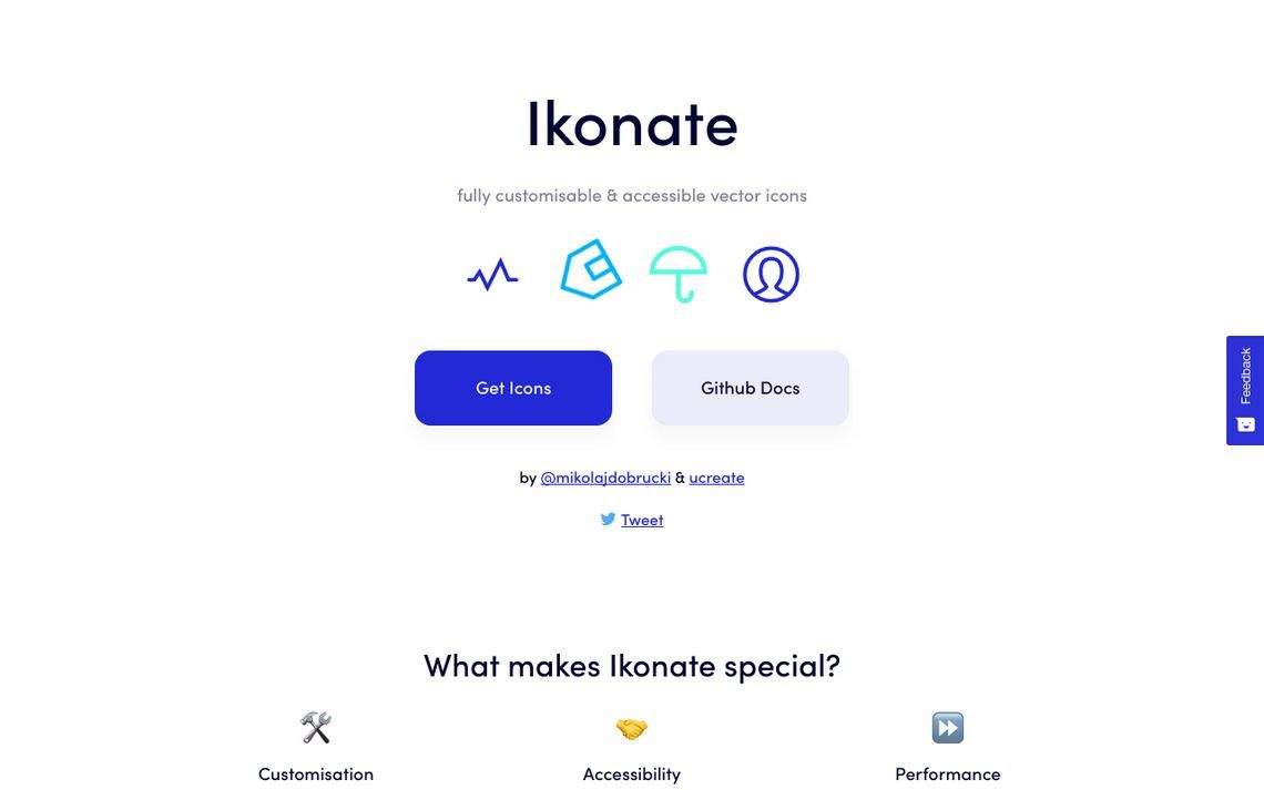
#Icons #SVGs #Accessibility #Productivity
Customise, adjust and download free vector icons. Ikonate is an adaptable set of optimised, accessible SVG icons that use can easily use in both development and design apps such as Sketch and Photoshop. Ready to use as images, inline SVGs or SVG sprites.
|
|
|
|
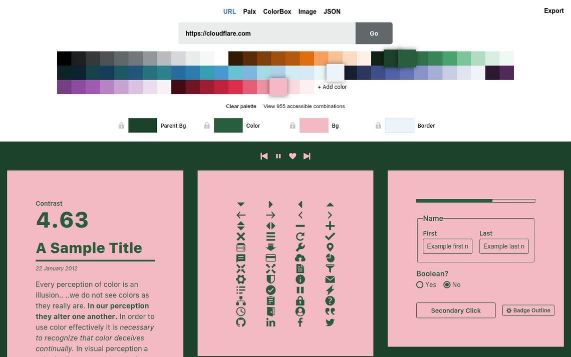
#UIDesign #Tools #Colors #Accessibility
A color palette tool for interface design
|
|
|
|
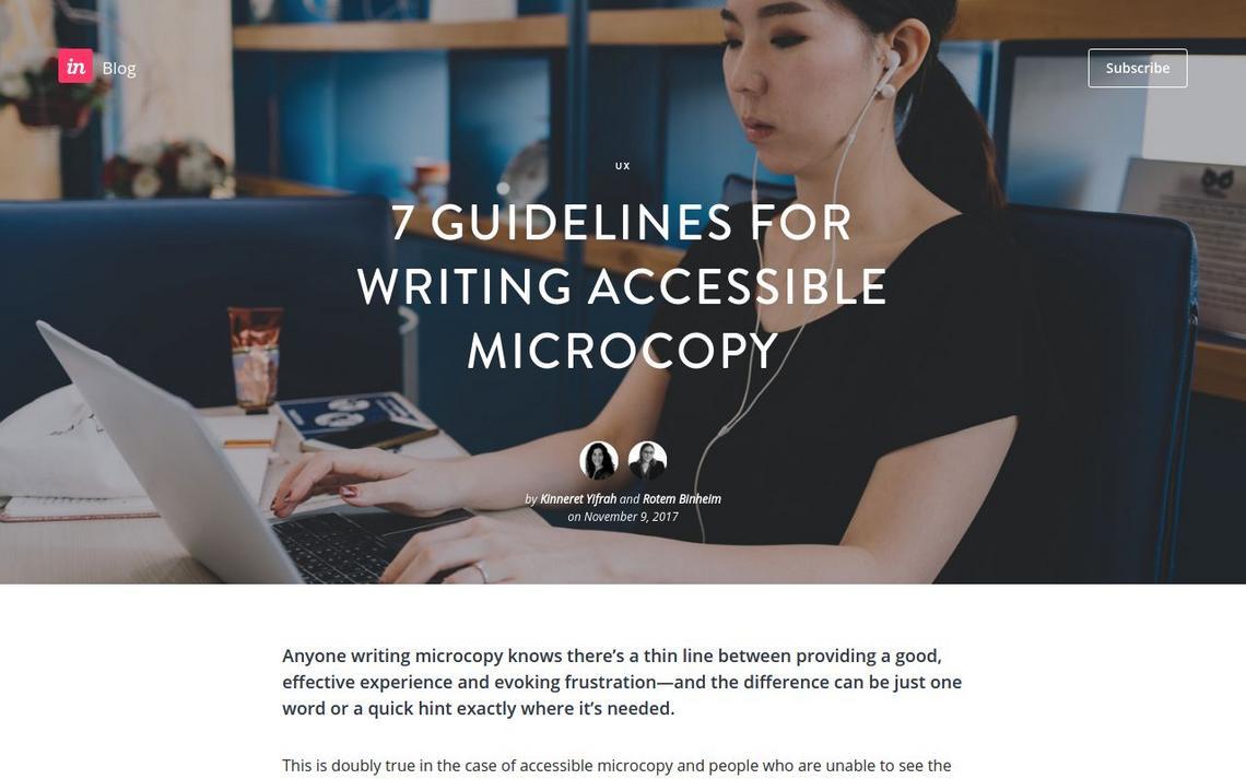
#Writing #UX #Accessibility
How does your microcopy sound on a screen reader?
|
|
|
|
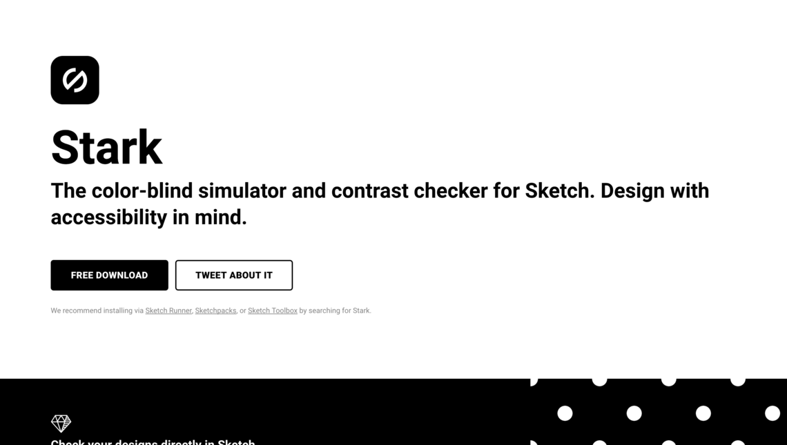
#Sketch #Design #Plugin #Accessibility
The color-blind simulator and contrast checker for Sketch. Design with accessibility in mind.
|